Responsive newsletter

The Responsive Newsletter options work for all designs that you have created using our drag & drop elements. The option does not work for designs imported from other sources.
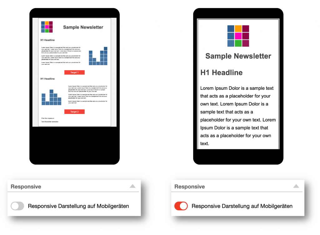
As long as the option for responsive display on mobile devices is not activated, the display for the desktop is simply scaled down so that an email is displayed in its entire width on the smartphone.
If the Responsive option is activated, your newsletter will be optimized for display on smartphones.
The following rules apply:
- The width of the layout is 95% of the width of the screen
- Headings and texts are displayed larger.
- The individual columns of multi-column layouts are displayed one below the other if this setting has been selected in the properties of the respective layout element.
- Image elements are scaled to the full width.
- Images that are located within a text element are not changed and retain their size.
- Button elements are displayed centered and enlarged.
Preview

The Responsive view is displayed in the mobile preview. This is a simulated display and does not necessarily correspond one hundred percent to the display on a real smartphone.
It is advisable to check the display on a smartphone by sending a test e-mail before sending the newsletter.
