Multi-column layouts
With layout elements, you can create responsive multi-column layouts in no time at all. In this way, you can specify a basic structure that you can then fill with any other elements.

Layout elements can be nested inside each other, but this is not advisable because nesting often causes display problems that are difficult to solve.
Context menu
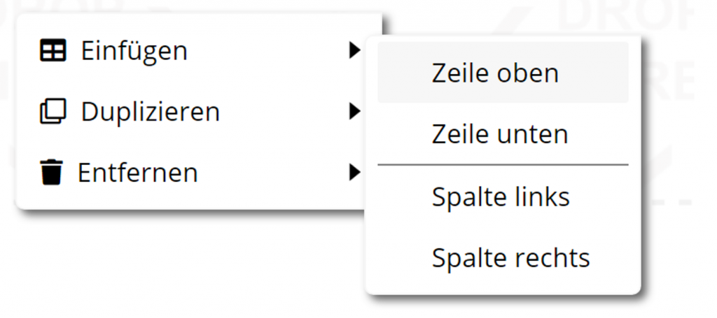
Clicking the right mouse button over a layout element opens a context menu:

With the command Insert additional rows and columns can be added to create more complex layouts. The Duplicate and Remove of rows and columns is possible.
Example

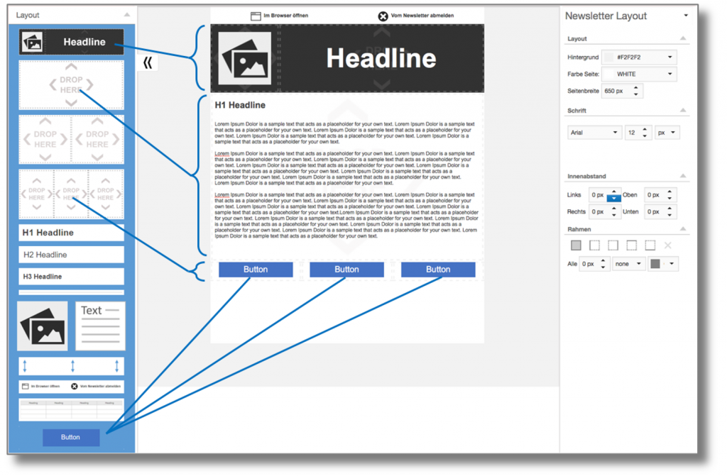
In the example above, we have the following structure:
Below the headline, there is a single-column layout element that contains an H1 headline and a text element. Below this, there is a three-column layout element, each with a button element.
Styles
Layout elements have the following style properties that you can customize:
Responsive properties

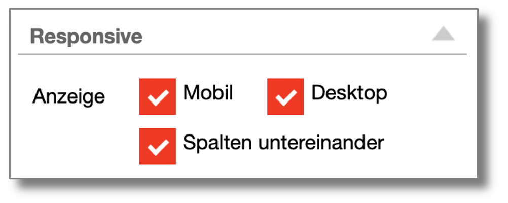
In the display, you can select the options Mobile and Desktop determine whether the element is displayed or hidden on mobile devices or on the desktop. This is useful if, for example, you want to display a different header for the mobile display.
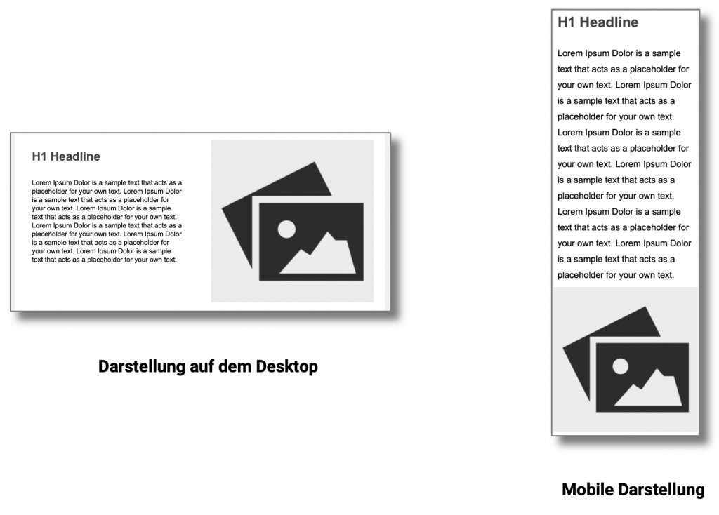
With the option Columns below each other the individual columns are displayed one below the other on smartphones. For example, if you have a two-column layout with a headline and text on the left and an image on the right, the mobile display will show the headline and text at the top and the image below.

